


You’ve discovered the perfect artwork - congratulations! Now, it’s time to ensure that your new piece is showcased to its best advantage. The wall colour you choose can make all the difference in how your art is perceived and enjoyed. At Watergate Art, we believe in making art accessible and enjoyable, and that includes helping you create a space where your art truly shines. Here are some tips to guide you in choosing the ideal wall colour to enhance and highlight your art.

Match with Similar Hues
Opt for a wall colour that echoes the background tones of your artwork. By choosing a shade close to the artwork’s background colour, you create a seamless look that enhances cohesion. For example, a deep purple wall can beautifully complement a painting with a similar background, allowing the piece to flow naturally within the space.

Choose Complementary Shades
Utilise the colour wheel to find complementary shades for your walls. Complementary colours—those opposite each other on the wheel—create a vibrant contrast. For instance, a bold turquoise wall can make artwork with yellow and orange tones pop, bringing a dynamic energy to the room.

Experiment with Different Shades
Play with varying shades of the colours found in your artwork. A painting with a simple colour scheme can gain visual interest when paired with a wall in a deeper or lighter shade of one of those colours. For example, a painting featuring shades of blue can be accentuated by a wall painted in a deeper blue hue, creating a layered and engaging effect.

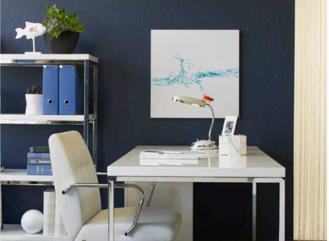
Stick to Specific Palettes
Some artworks are particularly suited to specific colour palettes. Black and white photographs, for instance, can be dramatically enhanced by pairing them with rich, bold colours like deep red or navy. If you have bright or neon pieces, they can stand out beautifully against deep black or grey walls. For a subtler approach, consider using these colours on a single accent wall to create a striking backdrop.

Opt for Neutral Backgrounds
Neutral walls can provide the perfect backdrop for showcasing your artwork, allowing it to take centre stage without competing colours. Simple whites or soft greys can make your art the focal point, as seen with tranquil pieces that benefit from a clean and understated setting.

Balance with Furniture and Accessories
The interplay between wall colour, furniture, and accessories also impacts how your artwork is perceived. Ensure that your room’s overall colour scheme complements your artwork.
For example, a yellow couch that matches the tones of nearby art creates a balanced and cohesive look, drawing attention to the artwork.

Similarly, coordinating colours between artwork and furnishings can create a harmonious visual flow throughout the space.

Even though it’s hanging all the way across the room, the pink artwork feels like a part of the scheme with a chair in the same colour
By carefully considering your wall colour in relation to your artwork, you can transform your space into a gallery-worthy display. At Watergate Art, we’re here to assist you in finding the perfect pieces and helping you create a space that reflects your unique style and taste. Our free Art Advisory service offers guidance from a curator to find artworks handpicked for you.
Stay Inspired
For more tips and to discover new artwork that complements your space, sign up for our newsletter and keep up with the latest trends in art and interior design.